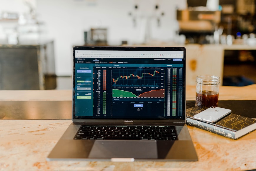
How To Understand Candlestick Patterns in Trading
When it comes to the foreign exchange markets, there’s a lot a trader must learn. An essential skill is understanding candlestick patterns. In trading, candlestick charts are price charts that display trends and reversals, with prices represented by candlesticks. This method of displaying prices was developed in Japan and first appeared in the 1700s. Rice merchant Munehisa Homma is considered the concept’s creator. He used candlestick charts on the rice futures market, with each candlestick visually representing four price dimensions throughout a trading period. These four dimensions consist of open, high, low, and close. A trade period is a duration of one second or longer.
Currently, candlestick charts are used to monitor trade prices on all financial markets. These markets include foreign exchange, commodities, indices, government bonds, and the stock exchange. The highest number of traded financial products is on the forex market. The prices at which these instruments are exchanged are recorded and shown visually using candlestick charts. Candlestick charts are the most used and known ways of displaying prices.
Why Is It Important
Analysis of candlestick charts is a crucial ability for traders. Using technical analysis, candlestick charts are used to illustrate the prices of financial products. Individual candles and their patterns may be scrutinized for the chart analysis. Long trades may be initiated using bullish candlestick patterns, while short trades can be initiated using bearish candlestick patterns. Candlestick charts are the most known and utilized among forex traders due to their visual nature. They emphasize the opening and closing prices of various periods more clearly than other charts, such as the bar chart and the line chart.
Candlestick charts provide a number of benefits:
- Forex price fluctuations are more readily observed on candlestick charts than on other types.
- It is easy to spot price patterns and activity on candlestick charts.
- Line charts provide less price information (open, close, high, and low) than candlestick charts.
Nonetheless, not everything is perfect, and candlestick charts have the following drawbacks:
- Green or red ending candles may mislead novice forex traders into believing that the market will continue to move in the same direction as the previous closing candle.
- Because candlestick graphs are not as straightforward as the line or bar graphs, they may clutter a page.
Candles Explained
A candlestick has three distinct components: the opening, the closing, and the wicks. If the closing price is higher than the open, the candle will become green or blue, depending on the chart settings. The candle will turn red if the closing price is less than the open price.
If the chart is set to daily, each candle represents one day, with the open price being the first price exchanged and the close price being the final price transacted in that time frame.
The open price is the initial price exchanged during the development of a new candle. It usually will be the highest point of the upper wick. In the absence of an upper wick, the high price corresponds to the opening price of a bear candle or the closing price of a bull candle.
In the absence of a lower wick, the low price corresponds to the opening price of a bullish candle or, in other cases, the closing price of a bearish candle.
The closing price is the final price exchanged during the creation of the new candlestick.
How To Use The Candlestick Charts in My Trading
Traders employ candlestick formations and price patterns as entry and exit points in the market. Candlesticks produce candle patterns such as the hanging man, hammer, and shooting star, among others; in addition to triangles, wedges, and head-and-shoulders patterns, Forex candlestick charts can generate other price formations. While these patterns and candle formations are common on forex charts, they are also applicable to other markets, such as equities (stocks) and cryptocurrencies.
The use of candlesticks in trading visually communicates market sentiment. A green candle signals optimistic market sentiment when the closing is above the open; this kind of candle is known as a bull candle. A closing lower than the opening price implies unfavorable market sentiment, represented by a red candle known as a bear candle. The wicks also indicate the market’s attitude. A lengthy wick on each side of the candlestick shows that the market has rejected a price level with force.
A market trend is sustained price movement in a specific direction. When prices rise persistently, the general market trend is upward. When prices continue to decline, the prevalent market trend is downward. Changes in the market’s trend may give lucrative possibilities for trading. Therefore, it is advantageous for traders to recognize changes in market patterns. In the forex market, trendlines are used to illustrate uptrends and downtrends through support lines.
How Candles Help You Spot Signs of Market Momentum
Candlestick charts are particularly useful for spotting shifts in market trends. A pattern of engulfing candles is one such sign of a possible market trend reversal. A bullish engulfing candlestick pattern might signal a move from a downturn to an uptrend in the market. Similarly, a bearish engulfing candlestick pattern suggests a move from an uptrend to a decline in the market. The formation of a bullish engulfing candlestick pattern occurs when a massive bull candle totally envelops the preceding, comparatively smaller bear candle. This pattern may indicate a shift from negative to optimistic market sentiment. It is consequently seen as a signal of a shift in market trends. Important to notice is the placement of these engulfing patterns in the context of the general price trend, so be careful to validate your views on the higher time frame before taking any impulsive actions.


